
Proofing the Prints
And so it begins! As I mentioned in the New Year's post, Jesseca and I have partnered with Shuffled Ink. They are a print shop based out of Winter Park, Florida* that specializes in playing cards and divinatory decks. I am always happy to support local businesses whenever possible, but frankly, with the uncertainties of the current US government, we thought it would be safest to work with a US-owned company. It's a sad reality that we cannot predict when this government will antagonize** another country, which would certainly impact our ability to get you all a physical copy of the deck. Which is all to say: the people at Shuffled Ink have been very lovely and patient with Jesseca and I as we muddle through this printing process.
To date, we have had two test prints, with a third set being printed and mailed to us as I write this. Yes, THREE proofs! I am confident that this third set will be the final proof, and I choose to believe this is an example where "Three is a mystical number related to Odin" as opposed to "Why are there two revisions needed??" However, if you fall into the later camp, please allow this blog post to elucidate you!
The First Print
We received the first test print with a huge sense of anticipation. I didn't have the foresight to record it, but if you're interested in a "Paul reacts," you can always go see the unboxing of the first beta print of the Odin Oracle cards on YouTube.
The proofs arrived printed on 11x17 glossy paper (aka tabloid or ANSI B for the paper nerds). This is how they will be printed before a machine cuts them into cards. The package also contained a proof of the box covers. It was shocking to see all the color printed in reality and I was so happy! But very quickly, I felt a sense of unease. A lot of the cards looked a bit too heavy and dark.
This was unfortunate to see, but not completely unexpected. All our colorization has been done digitally. Neither Jesseca nor I have been through this process of translating digital colors to a printed experience before. Intellectually, we both knew that ink-on-paper would look different than pixels-on-screen. We were ready for things to not be quite the same. But we were both caught a bit off guard that everything felt so… muddy. The shadowy backgrounds became a dark blur. The delicate moods Jesseca was invoking with pinks, golds are pale blue were feeling heavy and melancholy. In short, we knew we knew we needed to go with another printing.
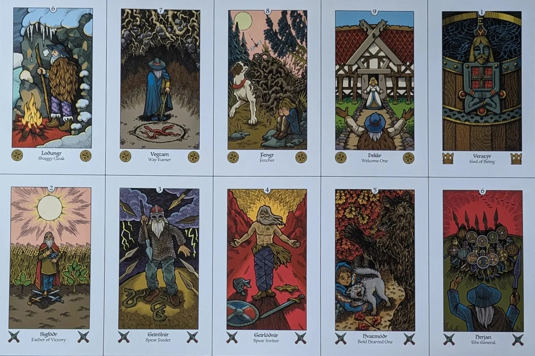
One page from the first set of proofs.
The Second Print
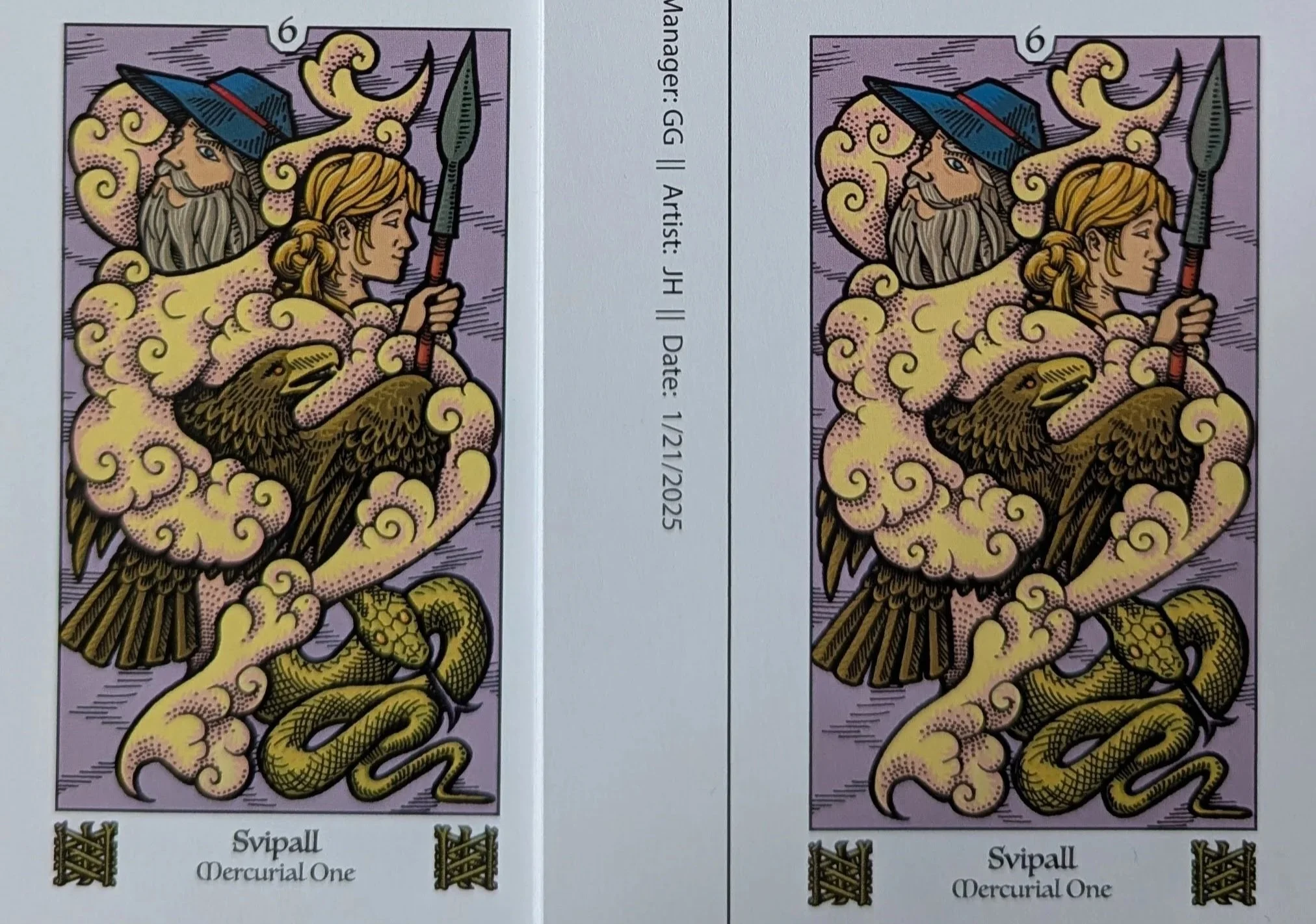
We received the second printing just last week! For this proof, we lightened the color by 10%. Our hope was that things would feel less heavy this way. We hammered out the process with Shuffled Ink, put in our order and waited for the proofs to arrive. Unfortunately, putting the two proofs next to each other, we just could not see the difference. For a minute, I was confused if any change had been made. So abashedly, we reached out to our Shuffled Ink contacts again for a third proof.
Interestingly enough, taking a picture for this post, I am able to spot the a difference between the two prints. Check out Svipall here: which do you think is from which printing? Regardless, sitting with them in person, neither Jesseca nor I could spot the difference.
For our third set, I proposed a 30% reduction in color saturation. They quickly came back to say that they did a quick test print and it looked really washed out. Instead of sending us something that we knew we wouldn't like, they proposed that the third set could have a 15% reduction and a 25% reduction. When that third printing arrives next week, we'll be able to see a gradation of our color intensities: 100%, 90%, 85% color and 75%. Keep an eye out for that on a future posting!
Closing Thoughts
So good work is happening and we are so tantalizingly close!
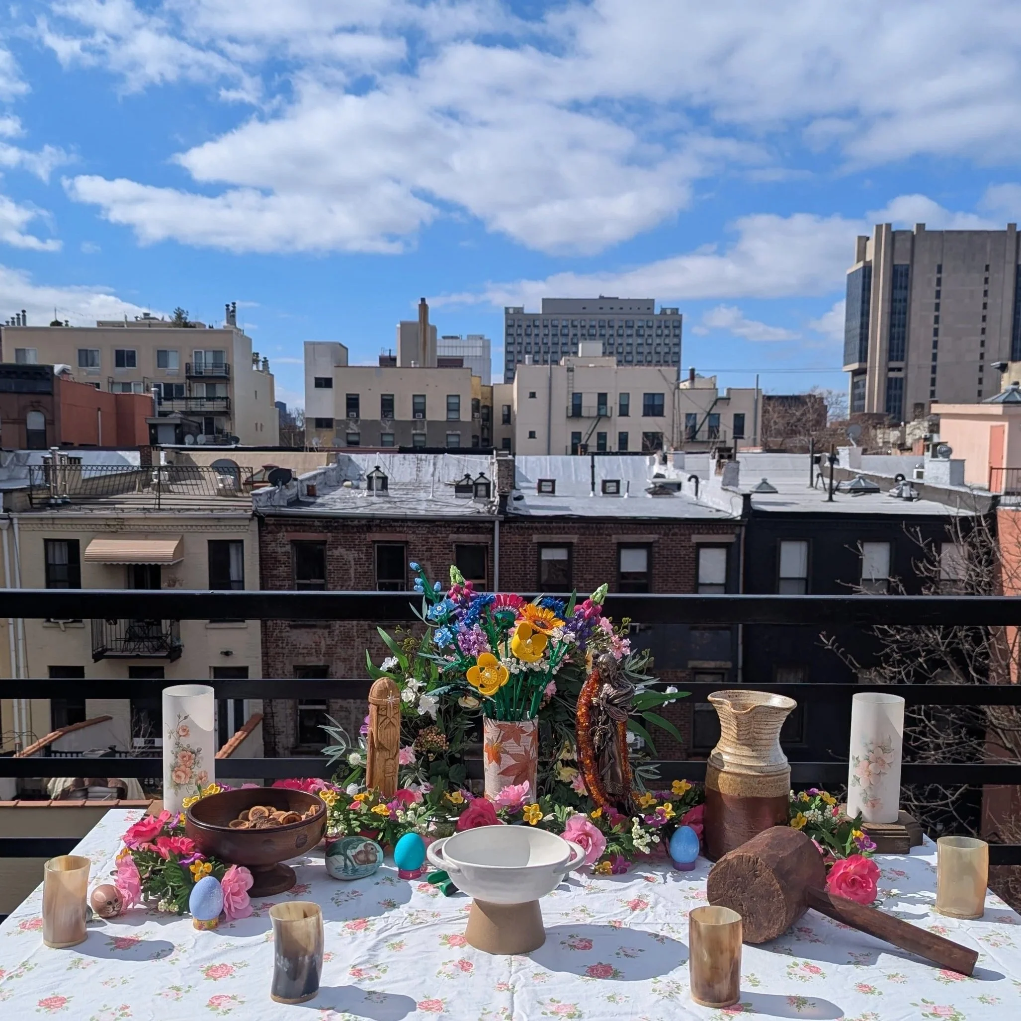
I didn't want to post about our frustrations and disappointments without having a clear path forward, and I finally believe we're there. As a consolation prize for reading through until the end, here is a photo of the Oschdra / Ostara altar I set up on the roof of my Harlem apartment. For those who are familiar with my personal practice, you'll see some items from my ancestors, as well as Tyr and Zisa making an appearance. It was a beautiful ritual with some close friends, and the messages of the season actually align well with the work that has been happening on this project: hidden growth emerging from winter, and celebrating color!
Until next time, be well!
PSM
* Funnily enough, I have a long history with Winter Park, Florida. There was a huge sinkhole there in 1981 and I studied it as part of my geology degree (#KarstTopography), and visited it decades ago with a dear friend who lives nearby.
**The word "antagonize" is doing a lot of heavy lifting in that sentence, but you all aren't here for my geo-political reflections, so I'm trying to keep things related to the Odin Oracle.