
All About Boxes
Jesseca and I just had a great collaboration session yesterday and I needed to write out a blog post to capture the excitement…!
Currently we have been working with a company to get the first printing of the Odin Oracle put together. We’ll be doing a smaller run for this first printing, but hopefully there should be enough for everyone. We’ve sent over color versions of all the cards and in lieu of printing a booklet for all 94 card meanings, we’ve added a 95th card with a QR code on it. This will allow us to edit and update the booklet digitally in parallel to the printing process; all with the hopes to getting this deck send out to you all as soon as possible. But yesterday was the first time we sat down with the template for the box. We’ve been messaging each other ideas all week and were excited to dig in.
Box Structure
When I got the test run printed a few years ago in black and white, they came with simple tuck boxes: those boxes where there’s a flap on the top and you pull out the cards. This is the “classic” style you see with playing card decks or the Pamela Coleman-Smith tarot (more commonly Rider-Waite*). However, these tuck boxes have always given me problems. Cards will get stuck behind the flap or the edges of the cards will tear. Worse, the boxes don’t hold up very well. In recently years (decades? oof, I’m old), I’ve started seeing more two-part boxes, which are much more durable. They’re made with chipboard and have a much nicer integrity. Sometimes cards can get stuck on the bottom, but if you just invert the box, the cards fall out naturally with gravity.

Three two-part boxes ganging up on the Coleman-Smith tuck box.
Obviously, Jesseca and I have gone with the two-part box. For accessibility reasons, we are also going with the thumb cut slots on the side. We want everyone to access these cards with ease. See below for a box with and a box without the thumb cuts. Financially, two-part boxes are more expensive than tuck boxes and the thumb slots are also an added charge, but we’re committeed to delivering the highest quality product here for you all.

Box Design
With the structure of the box settled, we started designing the cover for the deck. This will be the image that everyone sees when looking at our product and we’ve put a lot of thought into it. Like I said earlier, Jesseca and I were messaging each other a lot about this. First, we wanted art that wasn’t too cheery or too dark. We felt either extreme would promise an overall tone that the deck doesn’t convey. There is range to Jesseca’s art and we wanted to make sure the cover didn’t veer too far one way or another. We also wanted to keep things simple and legible. I also wanted art that would show off Jesseca’s graphic skills as well as her depth of knowledge. Specifically, I wanted to highlight her stunning line work, her deep understanding of herb lore, and her runic knowledge. To highlight the variety of tones, we are putting one of the more moody tones on one side of the box and a more cheerful image on the other side. To further underscore the variety, we’ll put a few thumbnails of the card are on the bottom. And this is what Jesseca came up with as a draft:
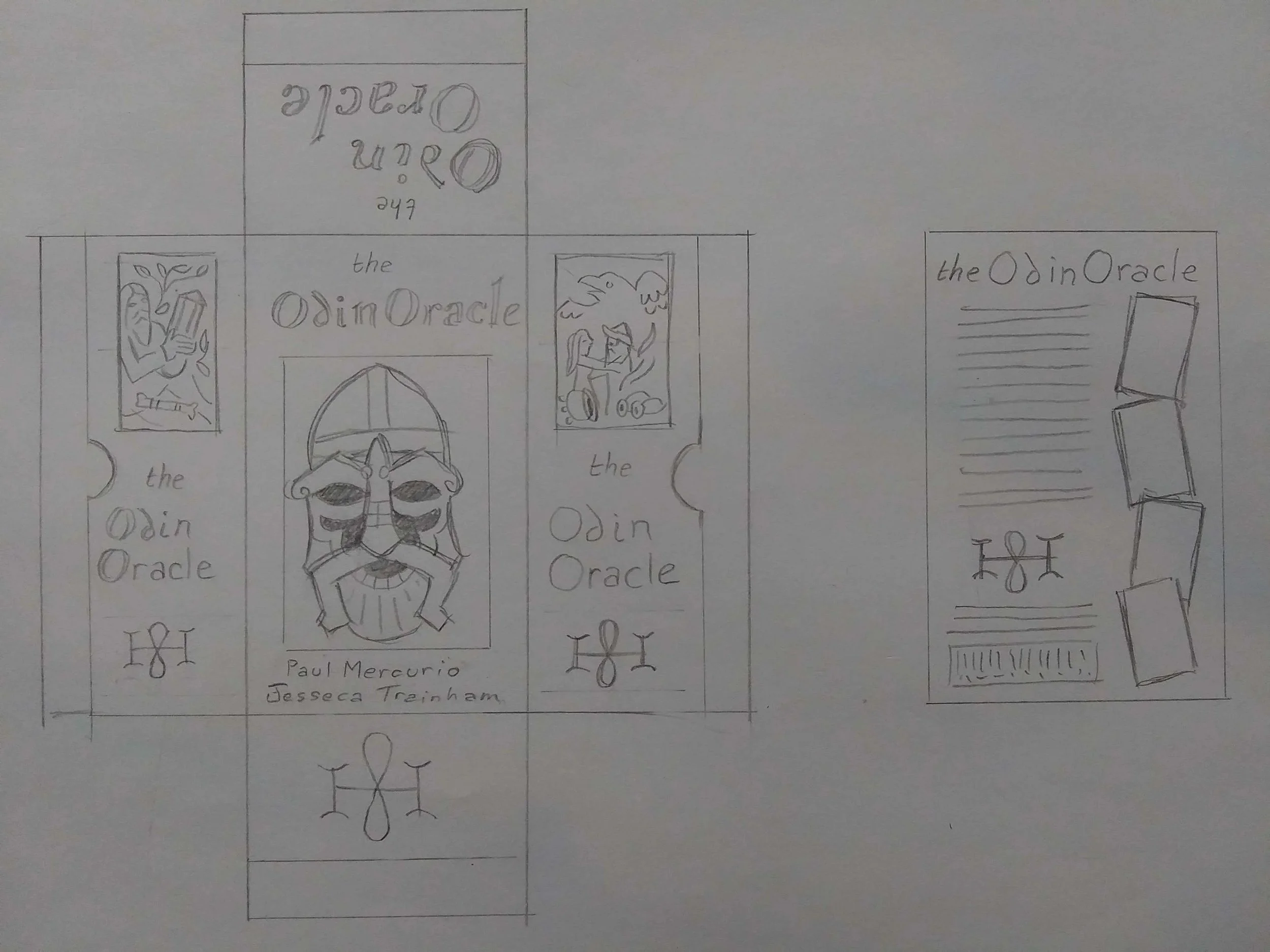
You’ll notice that first draft of a logo for 8hoof included as well! This was my first time seeing it and I instantly fell in love.
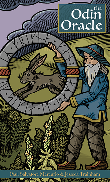
We spent some time tinkering together on fonts, letter spacing, colors and - of course - the main art for the box. We’re still debating on a blue / teal tone versus a more ruby / magenta tone for the box, but we plan to print out both options for the test print to see how they look on paper instead of lit up on a screen. Below is the blue / teal tone, which I also threw out onto Instagram immediately. I was so excited!!! But in case you missed it, here is one version of the first pass for the deck.
Let me know what you think!
*Note to self: Write a future blog post outlining why Jesseca and I prefer to call it the Coleman-Smith deck instead of the Rider-Waite deck.