Card Backs
With the release of the Odin Oracle, I want to take a moment to highlight an often overlooked feature of all good oracle decks: the card back!
Obviously the cards themselves are the heart of any physical oracle deck. As they say, the medium is the message. The physical cards are a big part of how people experience the deck being created. The size of the cards in your hand as you shuffle. The sheen and feel of the materials. The layout having clear margins, icons, and visible numbering. And of course, the card names and the art itself.
But the card backs? Just as important as all the other elements above!
In many ways, I feel the card back is the most enduring visual of any divinatory deck. We can all visualize the plaid of the Raider-Waite-Smith tarot, or Lady Freida Harris's iconic Rosicrucian cross on the back of the Thoth deck. When giving readings, I always start with the cards facedown, only to be revealed at the appropriate - dramatic! - moment. This means that we look at the back of the card for a good portion of a reading. Truly, their imagery is important.
In this manner, I believe Jesseca Trainham has once more hit a home run with her beautiful art.
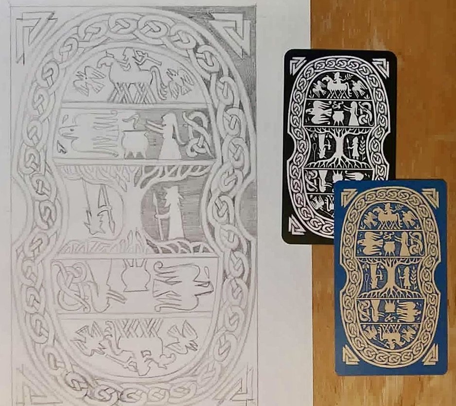
When creating the back, we discussed how the design should complement the deck at hand. The art should be reflective of the front of the cards, but also tell its own story. We also discussed how a card back should not immediately reveal whether a card is upright or reversed.... but we also wanted subtle differences if one is really interested to check.
With the black and white rendition done for our first test print a few years ago, we started discussing how we would incorporate color into the back. Jesseca developed a consistent color palette across the 94 pieces of art, so it was pretty straightforward to select a few darker shades and a few lighter shades.
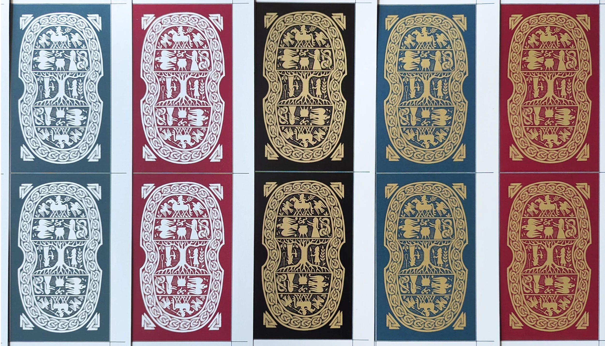
Above are the options we were considering when doing the test prints. Though they’re a bit lighter in the first printing, we ultimately went with the teal and tan. In addition to it being a great color pair, it matched the colors on the box which created a nice bit of consistency.
So what do you think of all this?
Are we being way too nerdy about something that's ultimately a card back? Or do you love the card backs as much as we do?
Did you notice all the mythical references in the art?
Does the teal and tan also make you happy or did another color pop out for you?